
Picking cabinet color sounds easy until you stand in front of paint chips, door samples, countertop swatches, and flooring options that all look different by noon than they did at 9 a.m. The best kitchen cabinets colors are not just the shades you like on a screen. They are the colors that work with your lighting, your layout, your countertop, and the way you actually live in your home.
For homeowners in the Tampa Bay area, that matters even more. Natural light can be strong, open-concept homes are common, and many kitchens need to feel bright without looking flat or sterile. A cabinet color that looks perfect in a magazine can feel completely different in a real kitchen with warm sun, tile floors, and everyday traffic.
How to choose the best kitchen cabinets colors
Before looking at specific shades, it helps to start with the room itself. Cabinet color does a lot of visual work. It can make a small kitchen feel larger, tone down a busy floor, warm up a modern layout, or give an older home a cleaner and more current look.
Light is the first thing to evaluate. A north-facing kitchen may make grays look cooler and whites look a little blue. A sunny kitchen with lots of Florida light can make bright white feel crisp, but it can also wash out pale finishes if the rest of the room is light too. That is why samples matter. What works under showroom lighting may shift once it is next to your backsplash and countertop.
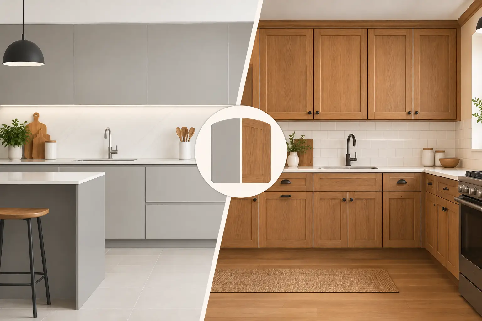
Style matters too, but not in a rigid way. Shaker cabinets in a soft white can fit almost any home. A slab door in a deep green feels more contemporary. Raised-panel cabinets in a warm cream can still look fresh if the surrounding finishes are updated. The goal is not chasing trends for their own sake. It is choosing a color that still looks right a few years from now.
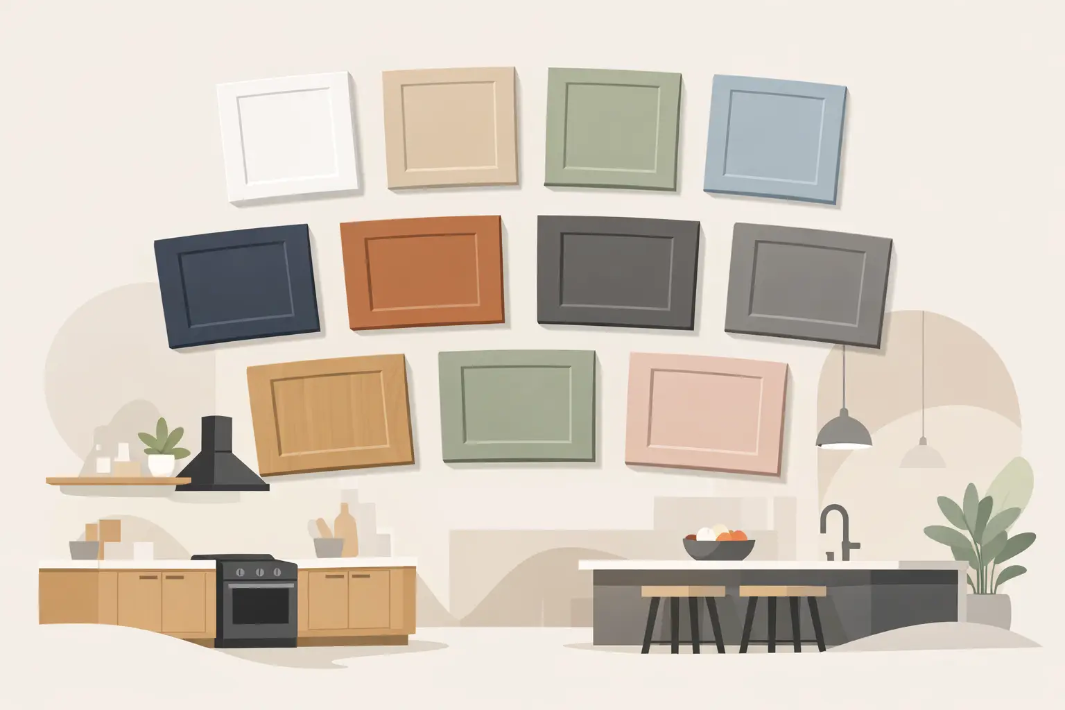
12 best kitchen cabinets colors worth considering
1. Warm white
Warm white remains one of the safest and smartest choices for cabinets. It brightens the room, works with most countertop materials, and helps kitchens feel clean without becoming cold. The key is the undertone. A warm white with a soft beige or creamy base tends to feel more welcoming than a stark bright white.
This color works especially well if you want a timeless kitchen or if you plan to sell in the future. It is also forgiving with mixed materials, so it pairs easily with wood-look floors, quartz counters, and brushed metal hardware.
2. Soft cream
Cream cabinets bring more warmth than white and can soften a kitchen that has a lot of hard surfaces. If your home leans traditional, coastal, or transitional, cream can be a strong fit. It also works well when you want a light kitchen but do not want the sharper contrast that white can create.
The trade-off is that cream needs the right supporting finishes. Put it next to a cool gray countertop and it may look too yellow. Pair it with warmer stone, brass accents, or natural wood, and it usually feels balanced.
3. Greige
Greige sits between gray and beige, which is exactly why so many homeowners like it. It reads as neutral, but it has more personality than plain gray and more flexibility than tan. In kitchens where you want a clean look that still feels warm, greige often lands in the sweet spot.
It is also a practical option if you have mixed tones in the space. Maybe your floor is warm, but your countertop has cool veining. Greige can help bridge that gap.
4. Light gray
Light gray has been popular for years because it looks modern without being too bold. On cabinets, it gives a kitchen a tailored and updated feel. It can be especially effective in homes where white feels too stark, but darker colors would make the room feel smaller.
Still, gray is very dependent on undertones. Some light grays lean blue, some lean green, and some lean taupe. That difference is subtle until it is covering your whole kitchen.
5. Taupe
Taupe is understated in the best way. It has enough depth to add interest, but it stays neutral and easy to live with. If you want cabinets that feel richer than white yet quieter than charcoal or navy, taupe is worth a look.
It also tends to age well. Trendier colors can start to feel dated faster, while taupe usually keeps a steady, classic appearance.
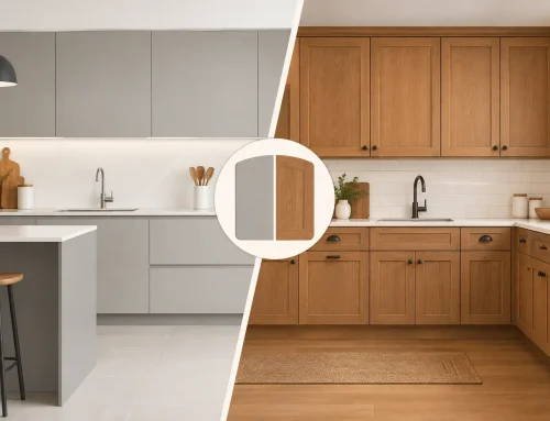
6. Natural wood tones
Not every kitchen needs painted cabinets. Natural wood finishes are back in a big way, especially white oak and other lighter wood looks. They add warmth, texture, and a custom feel without requiring a dramatic color statement.
For many homeowners, this is one of the best kitchen cabinets colors choices even though it is technically a finish rather than a paint color. Wood works well in coastal, organic modern, and transitional kitchens, and it pairs beautifully with white counters and simple hardware.
7. Sage green
Sage green gives you color without shouting. It feels calm, fresh, and a little more personal than gray or beige. In the right kitchen, it can bring in just enough softness to make the room feel finished and inviting.
This shade tends to work best when the rest of the palette is restrained. If your backsplash, countertop, and flooring are all busy, sage can get lost. If the supporting materials are simple, it can look thoughtful and high-end.
8. Deep green
A deeper green adds drama while still feeling grounded. It can be elegant, especially on an island or lower cabinets. In larger kitchens, full green cabinetry can look stunning. In smaller spaces, using it selectively may be the better move.
The big advantage of deep green is that it feels current but not overly trendy. The caution is that dark colors show dust, fingerprints, and smudges more than mid-tone finishes.
9. Navy blue
Navy has become a go-to cabinet color because it offers contrast without the harshness of black. It works with white countertops, warm metal hardware, and wood accents, and it can fit both classic and modern kitchens.
Like deep green, navy often shines on islands or base cabinets. In kitchens with limited natural light, all-navy cabinets may feel heavy. But in a bright, open room, they can add just the right amount of depth.
10. Charcoal
Charcoal cabinets create a strong, modern look. They are cleaner and softer than pure black, which makes them easier to work into a family kitchen. If you like contrast and want the kitchen to feel current, charcoal is a smart alternative to darker stained wood.
The trade-off is maintenance and mood. A charcoal kitchen can look sophisticated, but it needs enough light and enough contrast from counters or backsplash to avoid feeling closed in.
11. Matte black
Black cabinets are bold, and when they are done well, they can look incredible. They are usually best suited for larger kitchens, homes with lots of natural light, or designs where you want a strong architectural look.
For most homeowners, black works better as an accent than as the entire kitchen. Think a black island, a black pantry wall, or black lower cabinets paired with lighter uppers.
12. Two-tone combinations
Sometimes the best answer is not one color. Two-tone kitchens continue to make sense because they solve multiple design problems at once. Light upper cabinets keep the room open, while darker lower cabinets or an island add depth and hide wear a little better.
Common pairings include white and navy, cream and taupe, or wood and painted cabinets. This approach works especially well in open layouts where the kitchen needs some visual structure.
Best kitchen cabinets colors for different kitchen types
If your kitchen is small, lighter colors usually help. Warm white, soft cream, light gray, and greige can make the room feel more open. That does not mean dark colors are off-limits, but they need careful balance through lighting, counters, and wall color.
If your kitchen is large or open to the living space, you have more flexibility. Deeper shades like navy, charcoal, or green can anchor the room and make it feel designed rather than generic. In these layouts, an island in a contrasting finish often gives the kitchen a custom look without a custom-only budget.
If your home has warm tile floors, be careful with cool grays. They can fight each other. If your countertops have a lot of movement, a simpler cabinet color may be the better choice. When every surface competes, the kitchen starts to feel busy fast.
What homeowners often regret
The most common regret is choosing a cabinet color too quickly based on a trend photo. The second is ignoring undertones. White, gray, beige, and even green can look completely different once they are installed next to fixed materials in your home.
Another regret is choosing a dark cabinet finish for a kitchen that does not get much natural light. Dark cabinets are beautiful, but they are not magic. If the room already feels enclosed, they can amplify that feeling unless the rest of the palette is working hard to brighten things up.
This is where design guidance helps. A local showroom team can look at the full picture, from your flooring and countertop plans to your door style and budget. At The Cabinets Store, that practical, whole-room approach often saves homeowners from expensive color mistakes that only show up after installation.
The right cabinet color should still look good on an ordinary Tuesday morning, with sunlight hitting one side of the room and coffee on the counter. If you are choosing between a few strong options, the best move is usually the one that fits your home, your light, and your routine, not just the latest trend forecast.