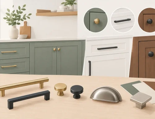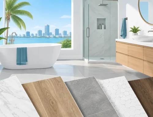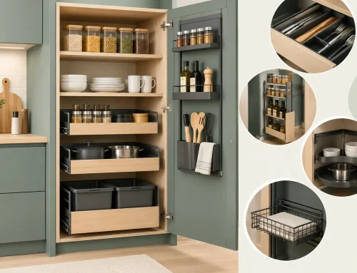


A cabinet color can make a dated kitchen feel current before a single appliance is replaced. The most appealing cabinet color trends right now are less about chasing a dramatic social-media moment and more about creating rooms that feel warm, useful, and easy to live with. For Tampa Bay homeowners, that also means considering strong natural light, open floor plans, and the humid Florida climate.
The right choice is not necessarily the color you see most often online. It is the one that works with your countertops, flooring, wall color, and the amount of daily wear your kitchen or bathroom receives. A well-planned palette can give an affordable cabinet line a polished, high-end appearance while helping your renovation stay within budget.
Cabinet Color Trends Moving Beyond All-White
White cabinetry is still a dependable choice, especially for smaller kitchens and baths. It reflects light, works with nearly every design style, and gives homeowners broad flexibility when selecting tile, counters, and hardware. But the sharp, cool white kitchens that dominated for years are giving way to whites with more warmth.
Think creamy white, soft ivory, and subtle off-white rather than bright, blue-based white. These shades feel more relaxed alongside warm wood flooring, brushed brass, natural stone-look counters, and handmade-look tile. They also tend to feel less stark in homes that receive plenty of Florida sunshine.
The trade-off is maintenance. White cabinets can show cooking splatter, fingerprints, and scuffs more readily than mid-tone colors. A durable finish and a door style with simple detailing can make routine cleaning easier, particularly in a busy family kitchen.
Warm neutrals create a quieter foundation
Greige, taupe, mushroom, and light putty colors are becoming popular alternatives for homeowners who want softness without choosing traditional beige. These colors have enough depth to create contrast against white walls, but they remain neutral enough to support future updates.
Warm neutrals are especially effective in open-concept homes because they connect the kitchen to adjacent living spaces without making the cabinetry feel like a separate design statement. In bathrooms, a taupe or soft gray-beige vanity can add a custom look while still feeling calm and practical.
Before committing, view samples in the actual room at different times of day. Paint undertones change quickly under Tampa Bay sunlight. A neutral that looks balanced in a showroom may read gray, yellow, or even pink against your existing flooring and wall paint at home.
Grounded Greens and Blues Add Personality
Color is returning to cabinetry, but in more restrained, nature-inspired ways. Deep green, muted sage, dusty blue, and blue-gray are leading choices for homeowners who want a kitchen or bath with more character than white can provide.
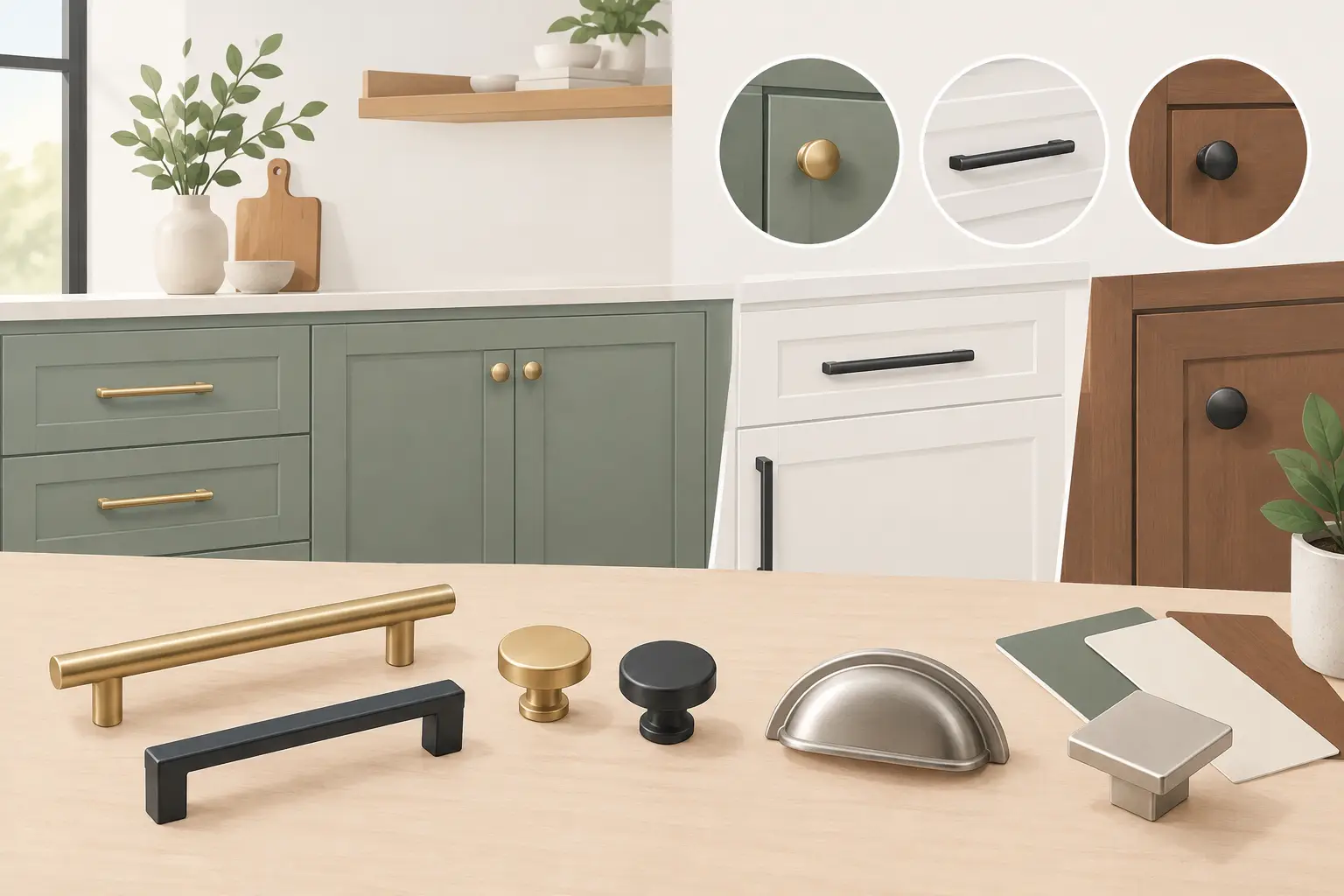
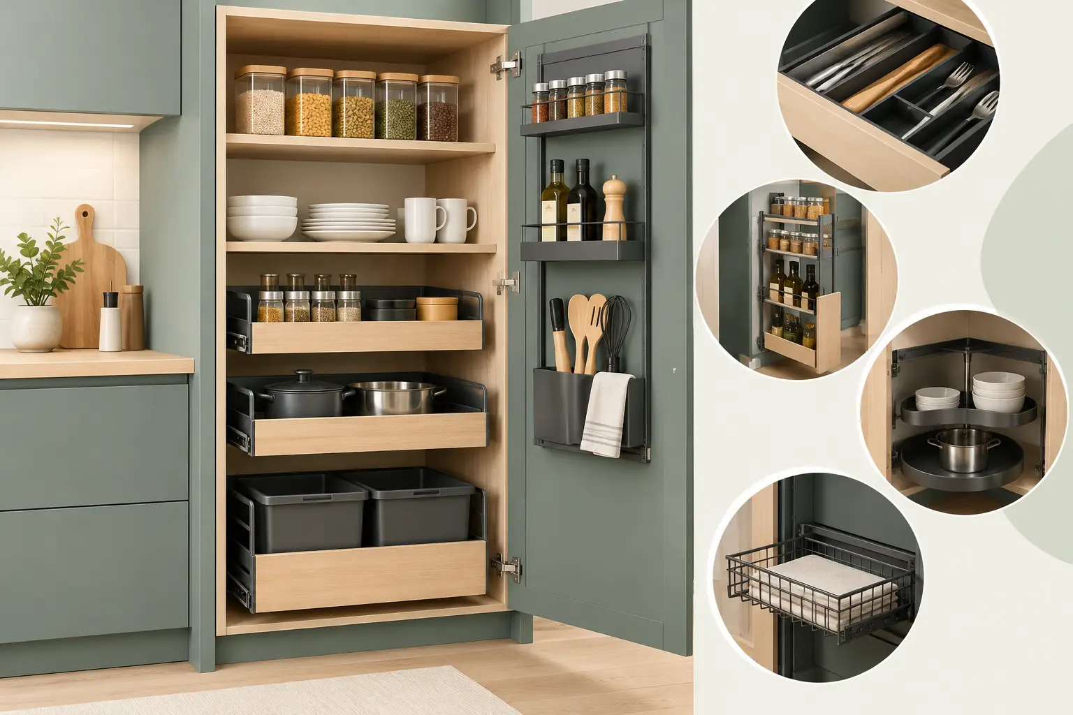
Deep greens work well on base cabinets, islands, and bathroom vanities. They pair naturally with white quartz, warm wood accents, and both black and brass hardware. A rich olive or forest green can make a kitchen feel tailored and inviting, especially when upper cabinets stay light.
Blues remain a strong option, though the trend has moved away from bright navy as the default. Softer slate blue, smoky blue, and blue-green shades offer a more relaxed look. These tones can feel especially at home in coastal-influenced Tampa Bay interiors without turning the room into a theme.
Color does come with a long-term consideration: bold cabinetry is more personal. If you expect to sell soon, a full kitchen of saturated color may appeal to some buyers and limit others. Using a trend-forward shade on an island, vanity, or lower cabinets is often the smarter middle ground. It gives the room a focal point while allowing the larger surfaces to remain more flexible.
Black is best when it has room to breathe
Black and charcoal cabinets can look striking, but they need the right setting. They are most successful in kitchens with generous natural light, high ceilings, or a thoughtful mix of lighter materials. Matte black lowers, for example, can look sophisticated beneath white uppers and pale countertops.
In a compact or poorly lit kitchen, dark cabinets can make the room feel smaller and may show dust, fingerprints, and water spots. The finish matters as much as the color. A low-sheen or matte finish generally softens the look and hides minor imperfections better than a glossy surface.
Natural Wood Tones Are Back in a Big Way
One of the most durable cabinet color trends is not technically a paint color at all. Natural-looking wood cabinetry is returning, particularly in white oak, walnut-inspired, and medium-toned finishes. Homeowners are responding to the warmth and visual texture that wood brings to kitchens filled with stone, metal, and clean-lined appliances.
Today’s wood cabinet styles are generally cleaner than the heavily stained cabinetry of past decades. Flat-panel doors, simple Shaker profiles, and restrained grain patterns keep the look current. Lighter oak tones feel airy and organic, while medium walnut looks richer and more dramatic.
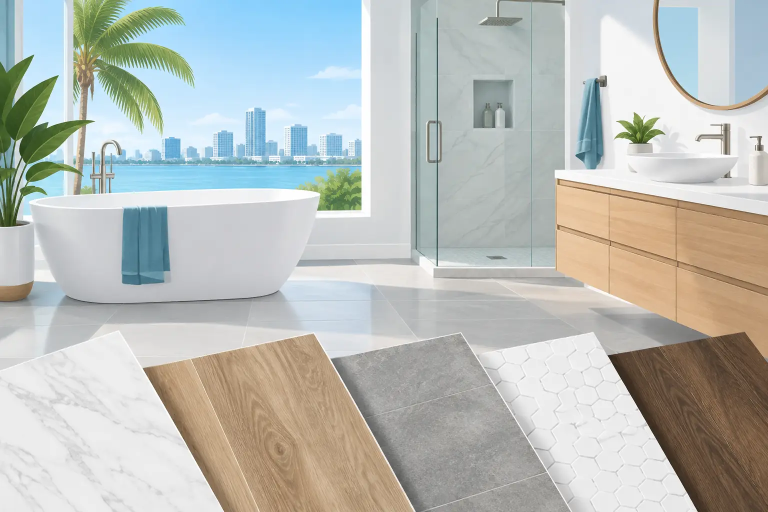
Wood cabinets also work beautifully in two-tone kitchens. A popular approach is warm wood base cabinets or an island paired with creamy white uppers. This combination keeps the room bright while preventing it from feeling flat. In a bathroom, a wood-look vanity can add warmth to cool tile and white fixtures.
The key is coordinating wood undertones. If your flooring has a strong orange, red, or gray cast, do not assume any wood cabinet finish will work beside it. Bring samples together before ordering. Similar wood species can still clash if their undertones compete.
Two-Tone Cabinets Are Becoming More Intentional
Two-tone kitchens remain popular, but the best versions are simple and purposeful. Instead of using several competing colors, choose one primary cabinet color and one accent finish. The contrast should help define the room, not make it feel busy.
White upper cabinets with a darker island are still a reliable formula. Another effective option is light perimeter cabinets with warm wood lowers, or a colored vanity paired with a neutral linen cabinet in a larger bathroom. The eye naturally rests on the darker or richer finish, so place it where you want attention to go.
Keep the other design elements disciplined. If the cabinets already provide contrast, choose a countertop that ties the colors together and avoid overly busy backsplash patterns. Hardware can be the finishing layer, not another competing focal point.
How to Choose a Cabinet Color That Will Last
Trends provide useful direction, but a cabinet color should serve your home for years. Start with the elements that are hardest or most expensive to replace: flooring, countertops, appliances, and large tile surfaces. Cabinets should complement those fixed features rather than force every other selection to work around them.
Also consider the practical rhythm of the room. A bathroom used by children may benefit from a forgiving medium-tone vanity. A kitchen where everyone gathers might need a light, open palette that makes the space feel larger. A homeowner who loves cooking may prefer a finish that does not highlight every fingerprint near frequently used drawers and doors.
Door style changes how color reads as well. A warm white Shaker door has a different personality than the same finish on a sleek slab door. Traditional raised-panel doors often suit classic neutrals, while modern flat-panel doors can carry darker colors and wood grains particularly well.
Finally, do not make the decision from a tiny sample alone. Compare a full door sample with your countertop, backsplash, flooring, and wall color. Look at it in morning light, afternoon sun, and evening artificial light. This small step can prevent an expensive surprise after installation.
A Local Design Plan Makes the Difference
Cabinet color is only one part of a successful remodel, but it affects nearly every other decision. A thoughtful plan helps you balance current style with resale comfort, cleaning needs, room size, and your budget. The Cabinets Store helps Tampa Bay homeowners compare cabinet finishes alongside counters, flooring, door styles, and hardware so the finished room feels coordinated rather than pieced together.
If you are drawn to a color trend, use it as a starting point rather than a rule. Choose the shade that still feels right when the samples are on your counter, the afternoon sun is coming through the window, and you can picture the room being used every day.